
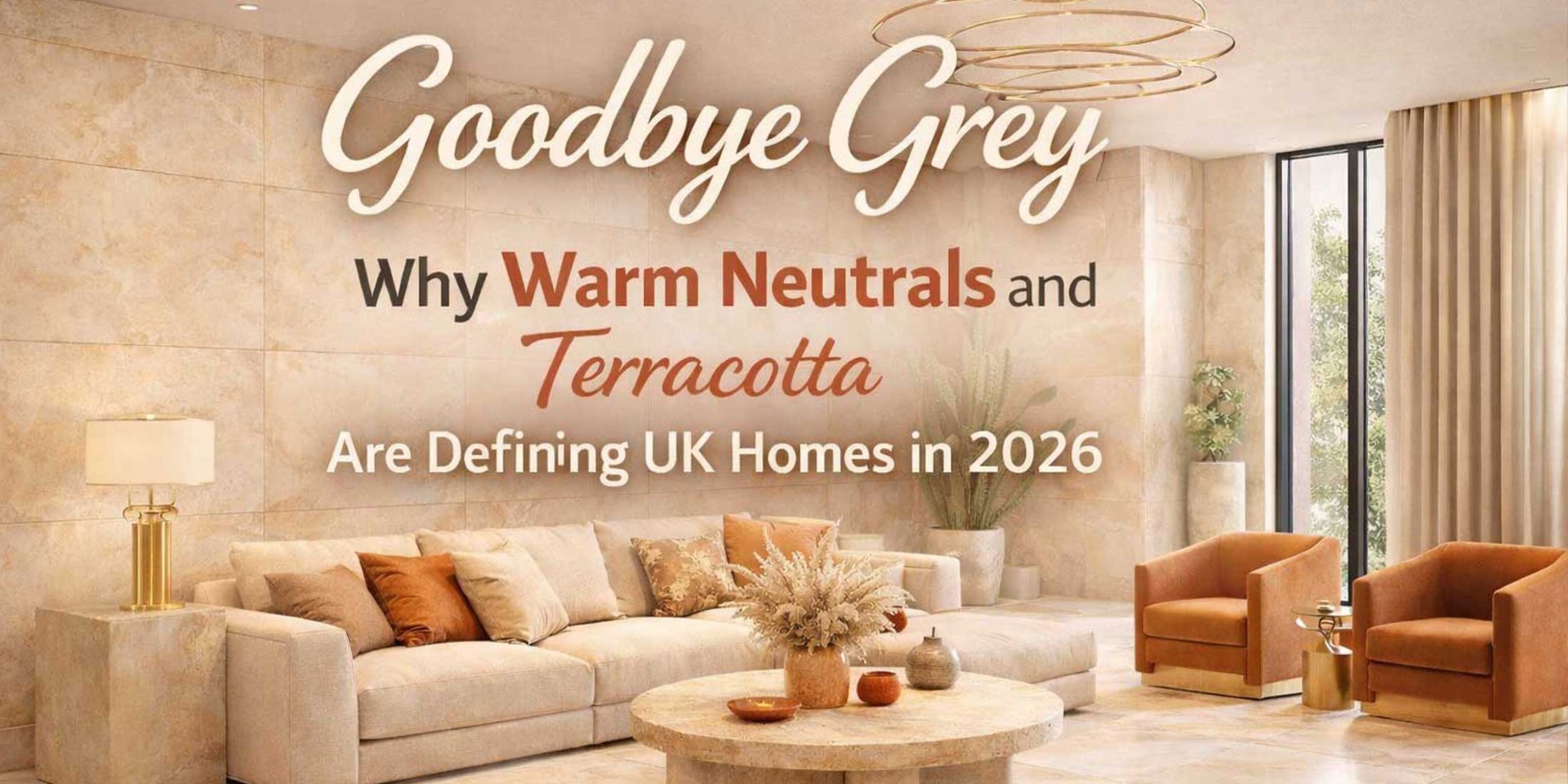
Goodbye Grey: The Sun-Kissed Shift Defining UK Homes
As we enter February 2026, the clinical "Millennial Grey" is making way for baked earth, honeyed sands, and Mediterranean warmth.
For nearly a decade, cool grey interiors dominated British homes — from polished concrete-effect floors to pale stone bathrooms and minimalist kitchens.
But as 2026 begins, that era is fading. Across renovation projects, new-build developments and luxury refurbishments, homeowners are embracing sun-kissed neutrals, Mediterranean warmth and earthy colour palettes that feel richer, calmer and far more personal.
Designers are calling this movement the “Sun-Kissed Shift” — a move away from sterile cool tones toward oat-coloured floors, terracotta walls and muted greens that bring comfort and character back into the home.
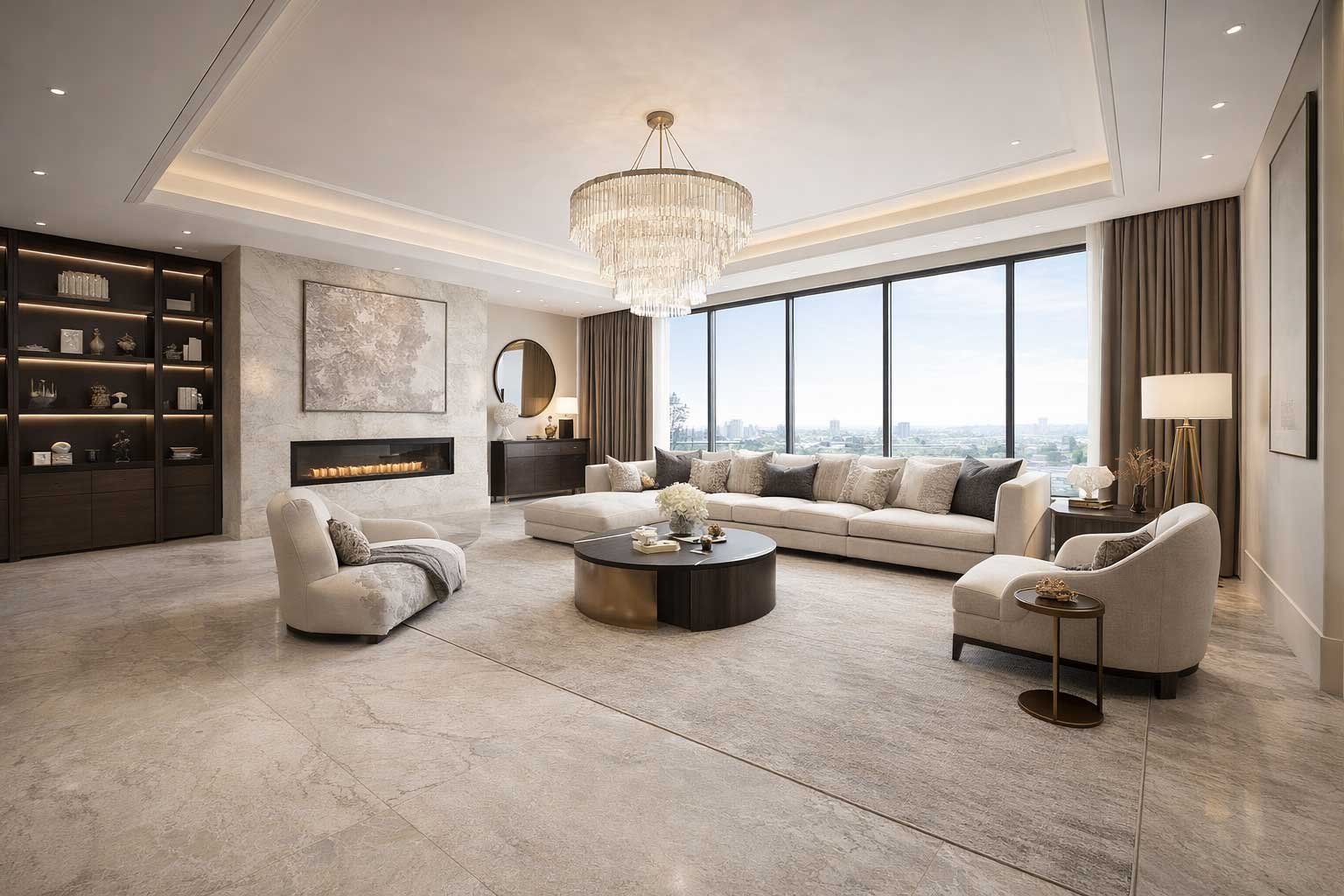
Why Cool Grey Is Losing Popularity
Grey is not disappearing entirely, but its dominance has softened. Many UK homeowners now associate cooler palettes with short-term design trends rather than long-lasting style.
- Feels clinical in low-light rooms
- Overused in rental-style refurbishments
- Lacks warmth during darker months
- Does not complement timber or brass finishes as well
The New Colour Palette: Sun-Kissed & Earth-Led
Muted Greens
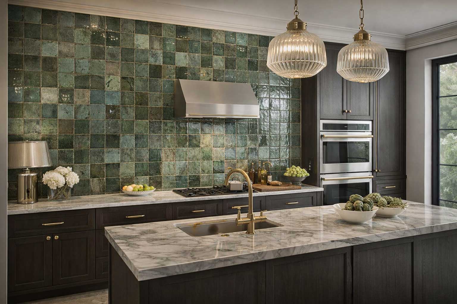
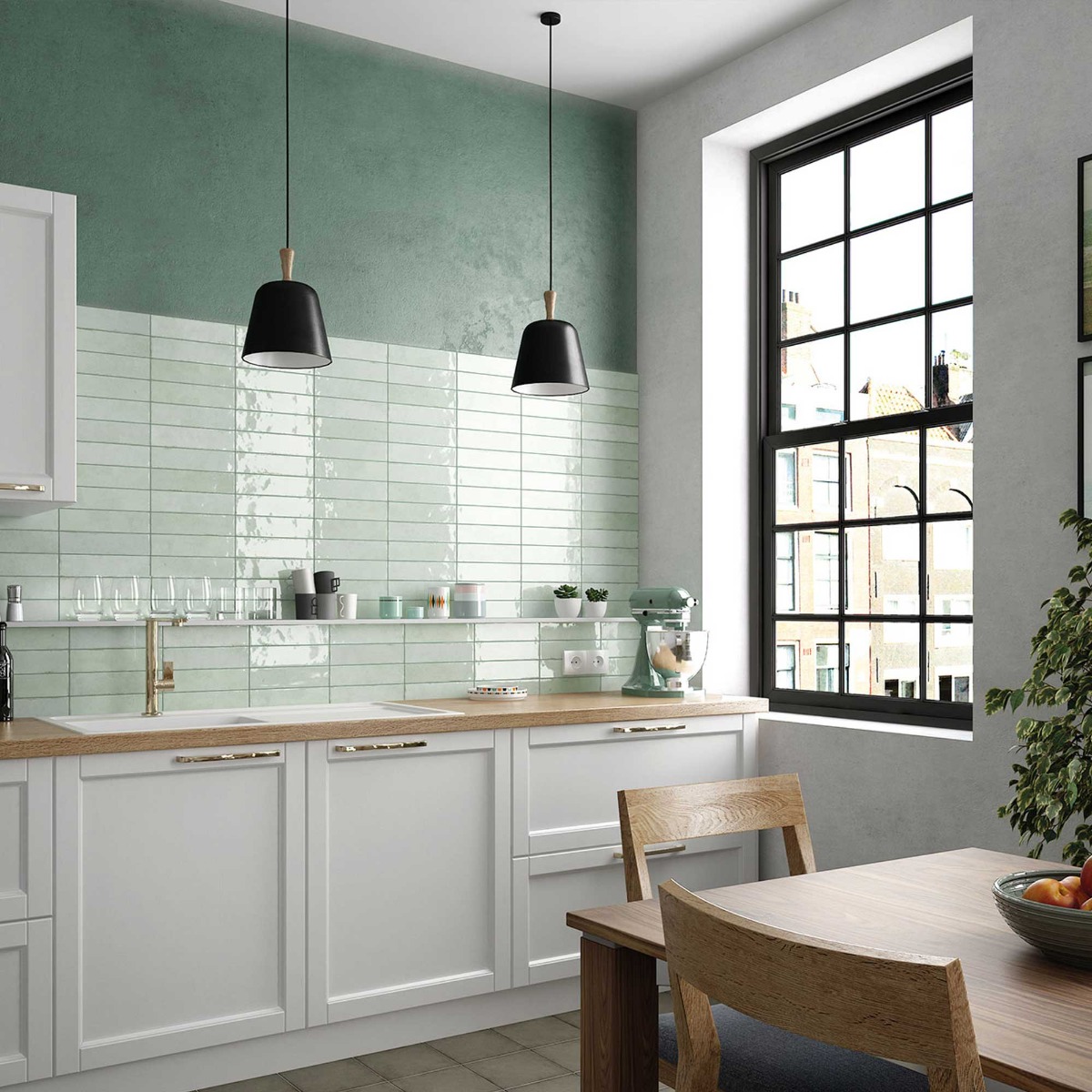
Sage, olive and eucalyptus tones are increasingly popular in bathrooms, kitchens and cloakrooms — offering subtle colour while staying calm and timeless.
Terracotta & Clay
Rust-inspired reds, cinnamon hues and sun-baked finishes work beautifully for feature walls, decorative splashbacks and Mediterranean-inspired spaces.
Warm Neutrals
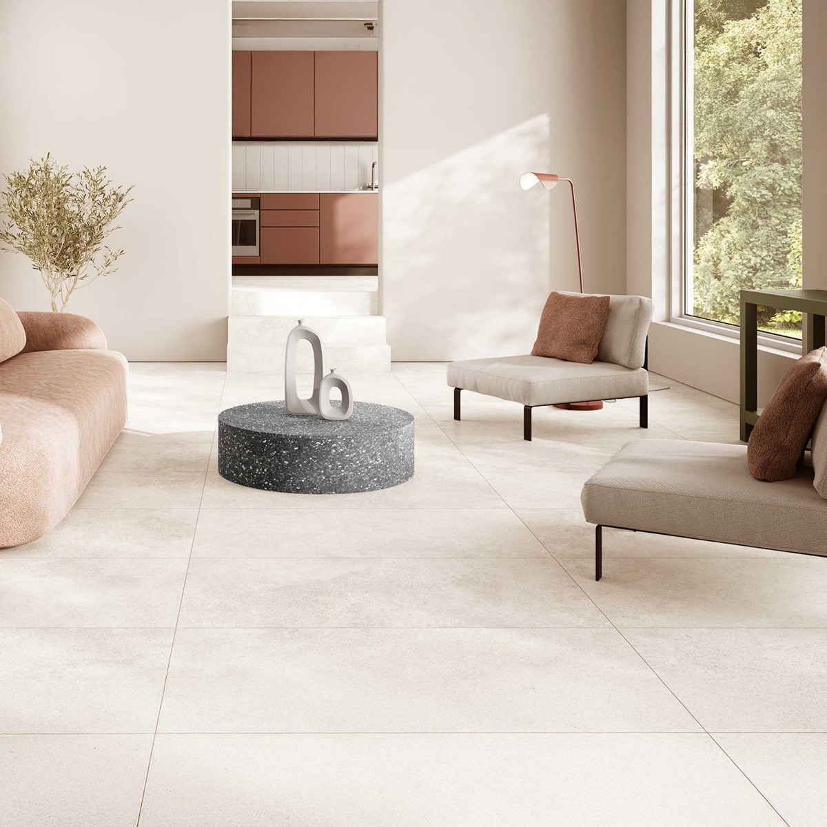
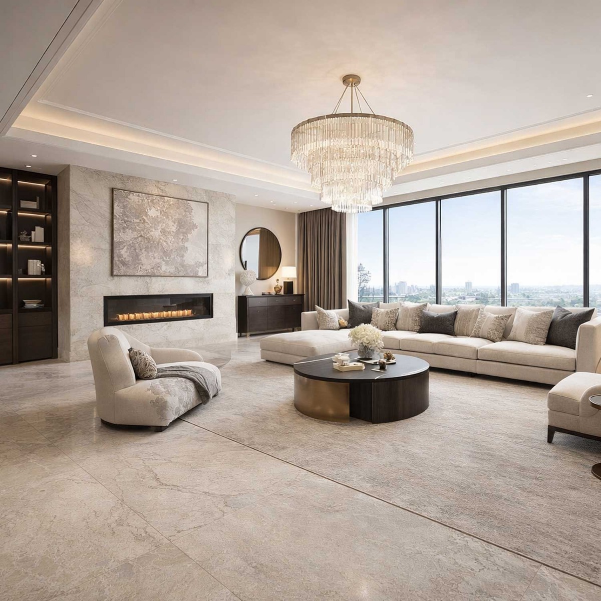
Shades such as oat, sand, biscuit and warm putty are replacing icy stone tones — especially in large-format porcelain floors.
The Look Everyone Wants: Modern Mediterranean
This shift is part of a broader design movement blending warm tiles, natural textures and confident hardware choices.
- Soft-matt stone-effect porcelains
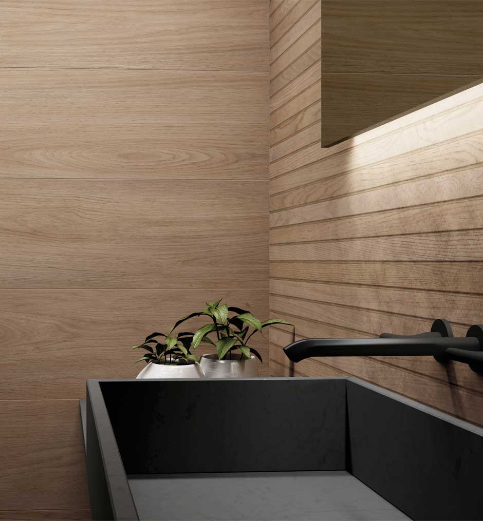
- Timber cabinetry and arched mirrors
- Limewashed or plaster-effect walls
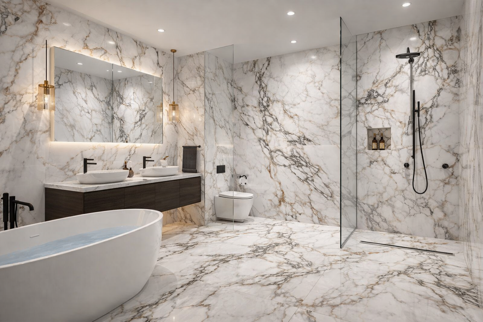
- Brushed brass taps for warmth and luxury
- Matte black frames and handles for contrast
The "Modern Med" Aesthetic
The key to keeping warm tones modern in 2026 is the hardware contrast. It’s about the tension between the organic tile and the industrial metal.
Option A
Brushed Brass
Best for: Ensuites and wellness spas. Brass amplifies the warmth of sand-colored porcelain, creating a high-end 'glow'.
Option B
Matte Black
Best for: Modern kitchens. Black provides a 'graphic frame' that prevents terracotta from looking too dated or rustic.
Tile Styles That Capture the 2026 Trend
To achieve this look, focus on collections featuring natural finishes and warm-led colourways:
- • Travertine-effect porcelain tiles
- • Warm terrazzo designs
- • Handmade-look ceramic wall tiles
- • Terracotta-effect floor tiles
- • Sage green gloss tiles
- • Soft-matt concrete finishes

Frequently Asked Questions
Do warm tiles make rooms feel smaller?
Not when light oat or sand tones are used. These shades often feel warmer and brighter than grey, particularly in north-facing UK rooms.
Are terracotta-effect tiles practical for busy homes?
Yes — porcelain terracotta-effect tiles offer excellent durability, stain resistance and easy maintenance.
Can I pair warm tiles with black fittings?
Absolutely. Matte black hardware creates crisp contrast and keeps warm schemes feeling contemporary rather than rustic.
Which grout colour works best?
Warm beige, almond or light taupe grout shades complement terracotta and oat-toned tiles far better than cool greys.


