Kerakoll Grout Colour Guide
Choosing grout colour is one of the most important finishing decisions in any tiling project. Grout can soften the overall look for a seamless surface, or highlight tile layout for a more defined style. This guide is built around the Kerakoll Fugabella Colour range — a decorative resin-cement grout for ceramic and porcelain tiles, mosaic and natural stone in a 50-colour design range.
Colour accuracy tip
Colours shown on-screen are for guidance only. Lighting, tile texture, joint width and curing conditions can influence the final appearance. If you’re unsure, choose a small test area before completing the full room.
Why choose Kerakoll Fugabella Colour grout?
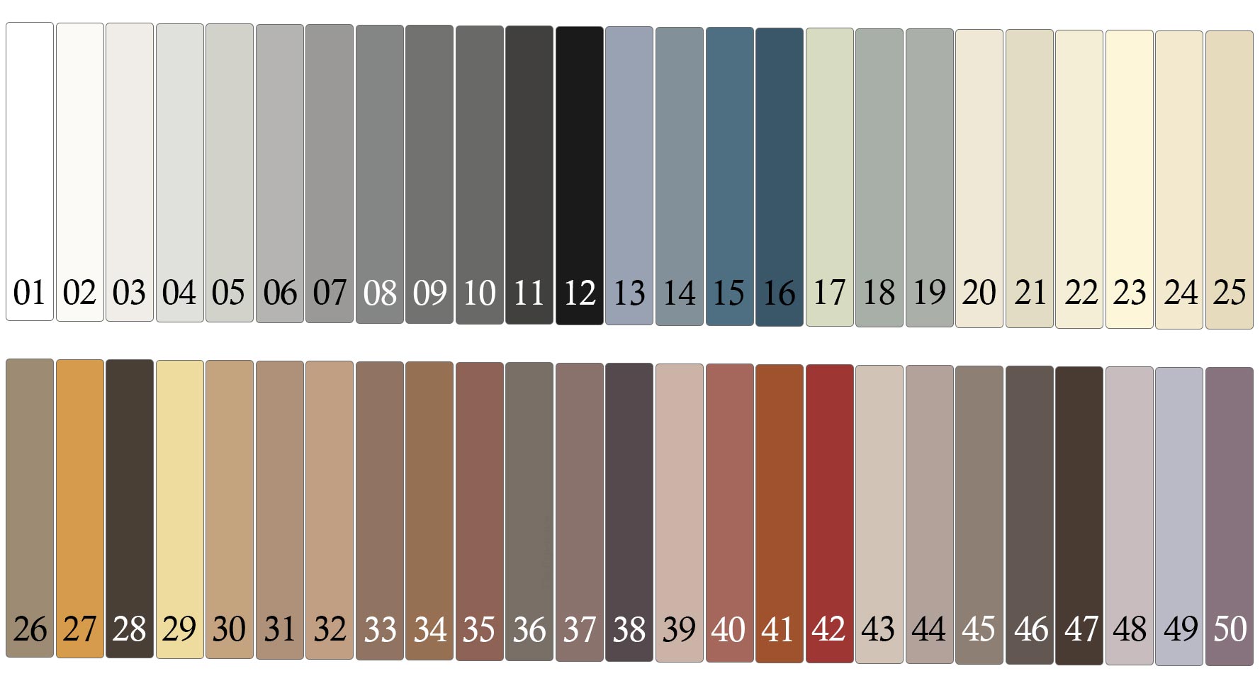
50-colour design range
A wide palette gives you more control over the final look — from subtle tone-on-tone joints to strong contrast lines that frame each tile.
For multiple tile types
Suitable for porcelain tiles, ceramics, low thickness slabs and natural stone, helping you keep a consistent finish across walls, floors and feature zones.
Easy to clean & maintain
Designed for a smooth, full joint that’s easier to look after, supporting a cleaner finish in busy spaces.
High colour uniformity
A consistent-looking joint helps your tiles look more premium — especially with large-format tiles, matt finishes and modern layouts.
Kerakoll Fugabella colour charts
Click an image to open full size
Tip: Compare charts under your room lighting. Warm lighting can soften greys; daylight can make whites and creams appear brighter.
How to choose the best grout colour
1) Match the tile
Choose a grout shade close to your tile to reduce visible grid lines. This creates a calmer, more continuous surface — ideal for modern bathrooms, wet areas and large-format floors.
2) Add contrast
Use a lighter or darker grout to frame each tile and emphasise layout. Great for metro tiles, mosaics, patterns and feature walls where you want the design to stand out.
3) Think practical
Mid-tone shades are often a smart balance for everyday maintenance. Wider joints also make grout colour more noticeable, so test first if you’re unsure.
Quick checklist before you decide
- Tile finish: Matt, textured and polished surfaces can read differently next to grout.
- Joint width: Wider joints = stronger colour impact.
- Lighting: Check colour in daylight and evening lighting.
- Test area: Allow it to cure before judging the final shade.
Shop Kerakoll grout
Explore Kerakoll grouts and choose the best option for your tile type, joint width and installation area.
FAQs
How many colours are in the Kerakoll Fugabella Colour range? Open Close
The Fugabella Colour grout is presented in a 50-colour design range, giving you plenty of options for matching grout to tile or creating contrast.
What surfaces is Fugabella Colour grout suitable for? Open Close
It’s suitable for grouting ceramic and porcelain tiles, mosaic and natural stone, including use on porcelain, ceramics, low thickness slabs and natural stone.
How do I choose a grout colour that looks seamless? Open Close
Choose a grout shade close to your tile colour. This reduces visible grout lines and helps create a calmer, more continuous finish — especially effective with large-format tiles and modern layouts.
Why can grout colour look different after installation? Open Close
The final look can change with room lighting, tile texture and joint width, plus curing conditions. Always compare your preferred shade in the room and allow any test area to cure before deciding.